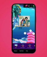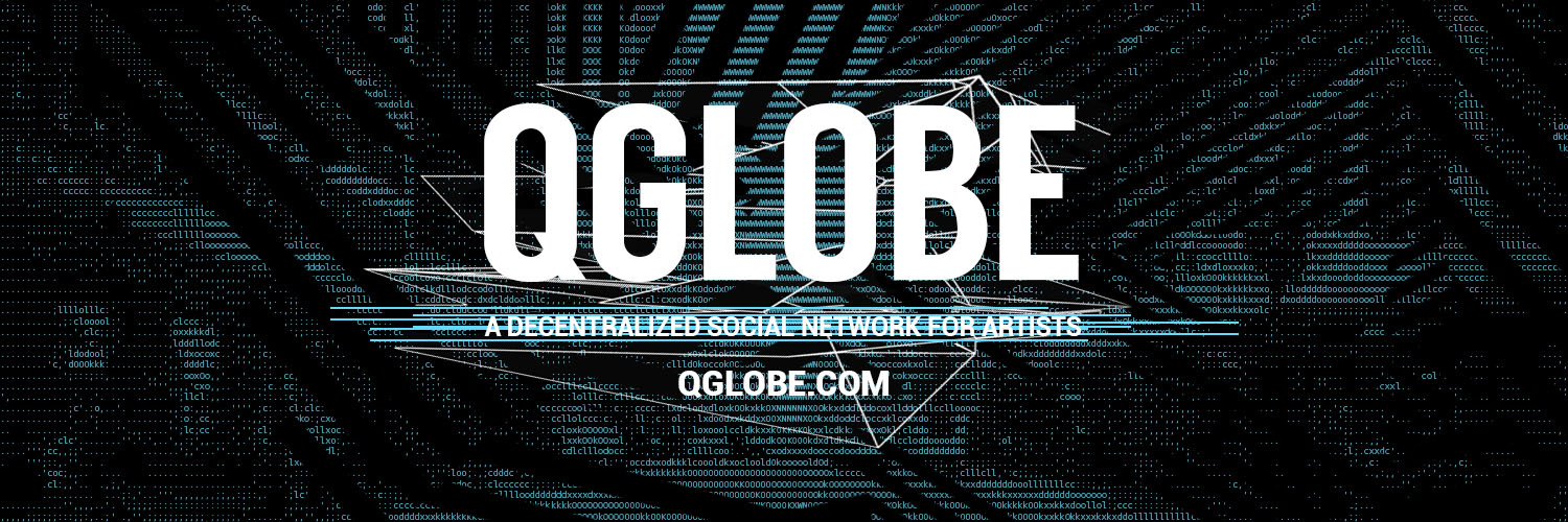

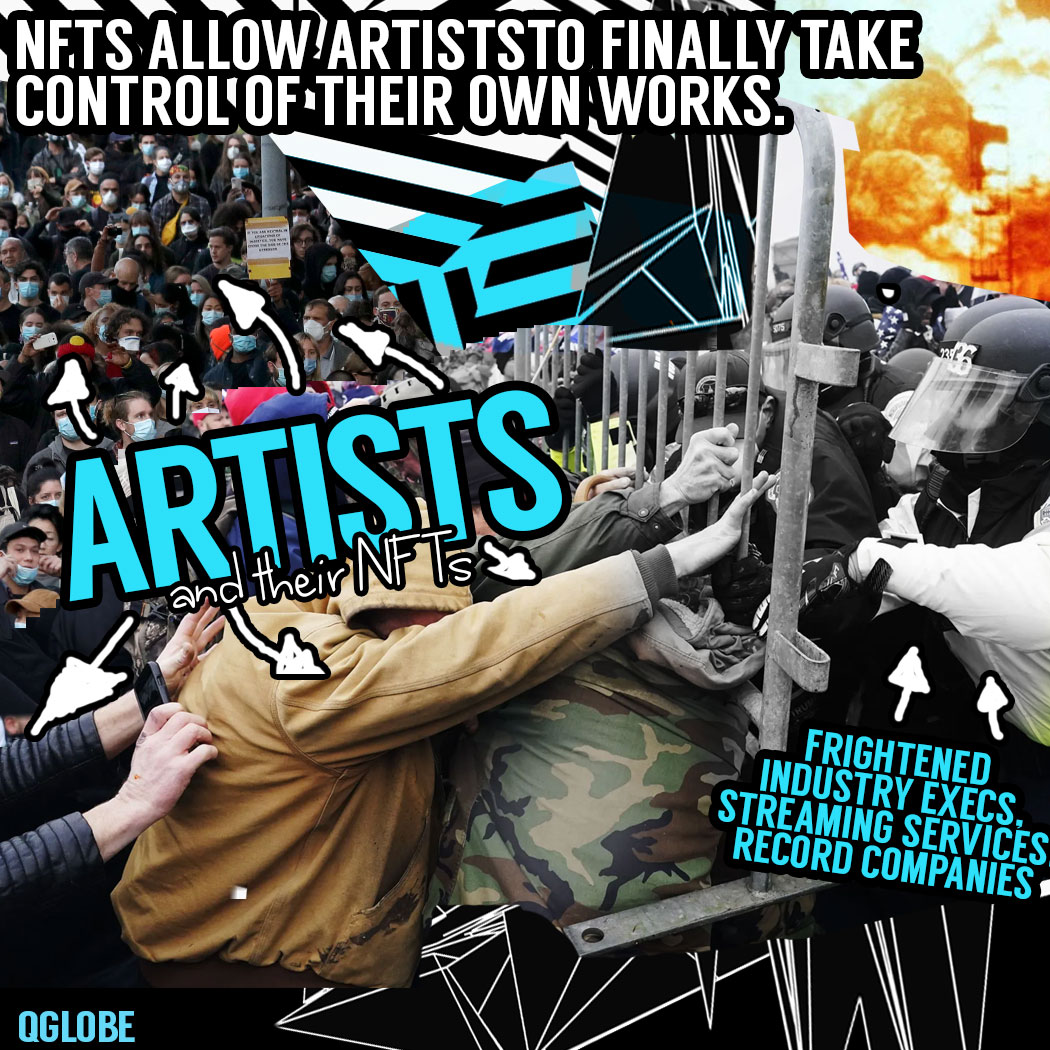


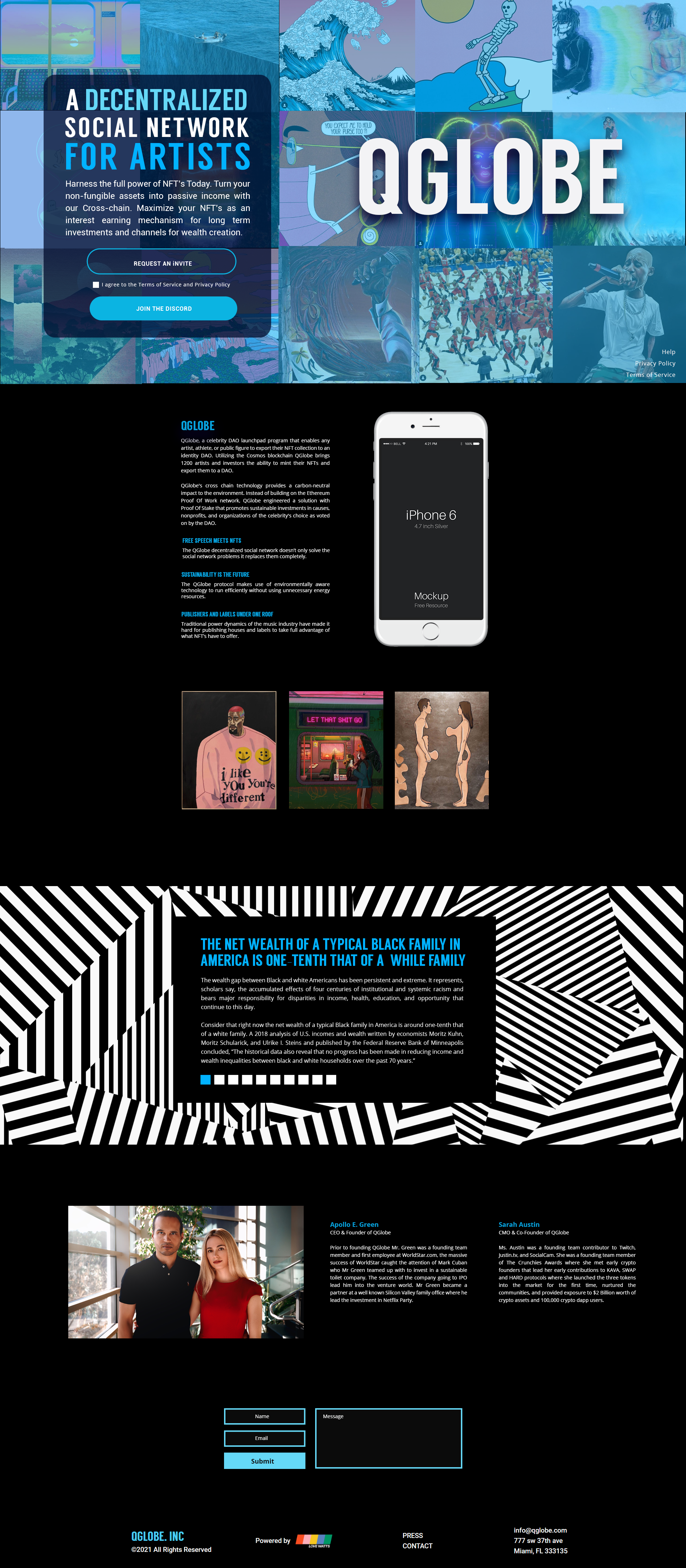
I was thrilled to work with the team at QGlobe on creating a bold and edgy branding look that would appeal to their target market of NFT enthusiasts, anarchists, and futurists. They had reached out to me through Craiglist with a request for a very cyberpunk aesthetic, filled with ASCII style imagery.
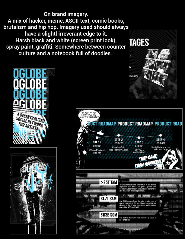
I began the process by immersing myself in the cyberpunk genre, researching the visual language and themes that are commonly associated with it. This included exploring the use of neon colors, metallic gradients, and futuristic typography. I also spent time getting to know the team at QGlobe, understanding their vision for the brand and what they hoped to achieve with their marketing efforts. This helped me to develop a better sense of the tone and style that would be most effective for their target audience.
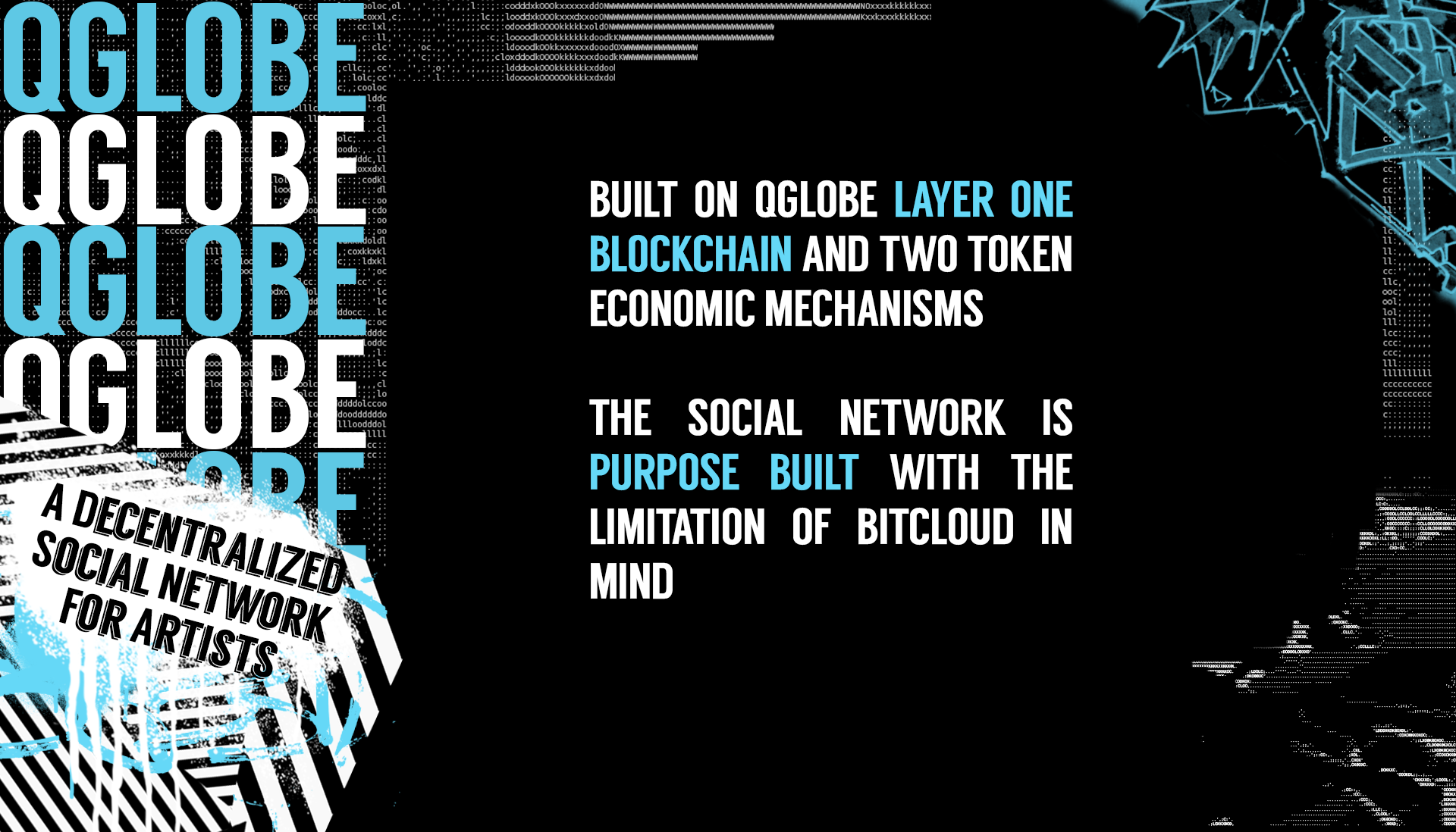
With this information in hand, I began to sketch out various concepts for the branding look of QGlobe. I experimented with a range of design elements, including different fonts, iconography, and color palettes, until I landed on a final design that I felt truly captured the cyberpunk aesthetic that QGlobe was looking for.
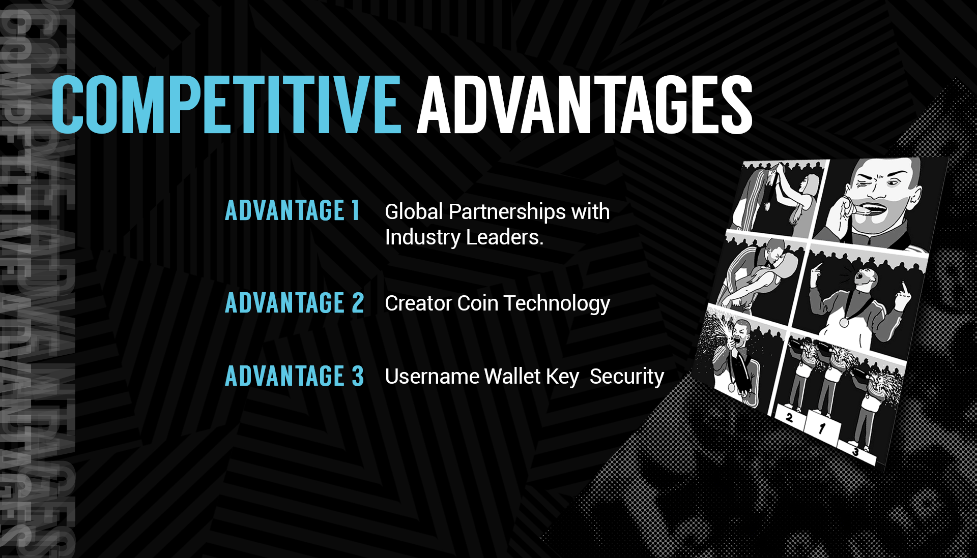
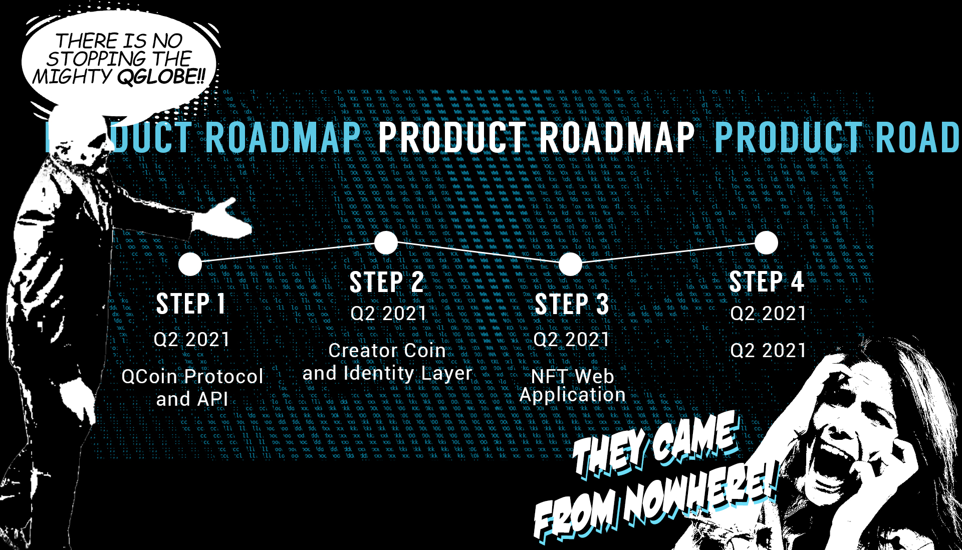
The resulting branding look was bold, 90s-futuristic, and full of ASCII style imagery, perfectly capturing the edgy, cyberpunk vibe that QGlobe was aiming for. The team at QGlobe was thrilled with the final result, and I was proud to have contributed to their marketing efforts in such a meaningful way. Eventually, we had parted ways and they would further transform their brand into something more traditional amongst the web 3.0 community.