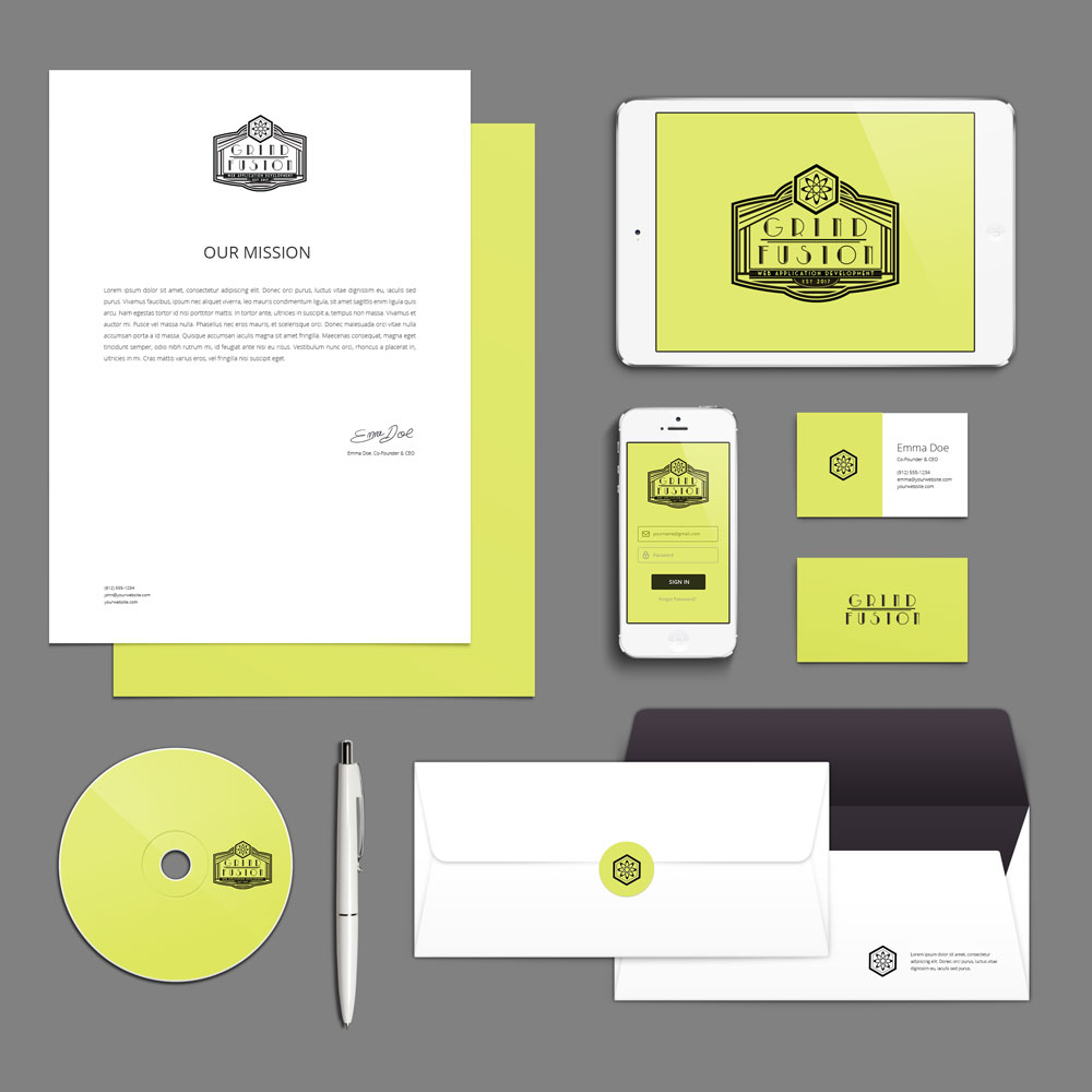

Hip, Colorful, Nerdy, Future driven while keeping tradition. All of these were values explained to me in the brief. After determining a sci-fi, but chic color scheme, the art-deco / neon look came to mind. The client loved the flexibility and modular approach to having “2 logos in a logo”. Having the emblem as a part of the main logo allowed us to play with minimal symbols and breaking the logo up. Very fun project.
The brief for the project was clear and specific – Grind Fusion wanted a logo that was inspired by the art deco style of the 1950s, with a sci-fi twist and a bold neon green and harsh black color scheme. They also requested that the design incorporate geometric repetitions to create a cohesive and visually striking look.
I knew that this was going to be a challenging but rewarding project, and I was determined to deliver a logo that exceeded Grind Fusion’s expectations. After researching the art deco and sci-fi styles in depth, I began sketching out ideas and experimenting with different combinations of shapes and colors.
Finally, after several rounds of revisions and refinements, I was able to present Grind Fusion with a logo that perfectly captured the retro-futuristic aesthetic they were looking for. The neon green and harsh black colors, combined with the intricate geometric repetitions, created a sense of sophistication and modernity that perfectly reflected the mission of Grind Fusion.
I am proud to have had the opportunity to work on this project, and I believe that the final logo truly reflects the innovative and forward-thinking spirit of Grind Fusion. It was an honor to contribute to the success of this dynamic web app developer, and I am confident that this logo will serve as a powerful and memorable symbol of their brand for years to come.