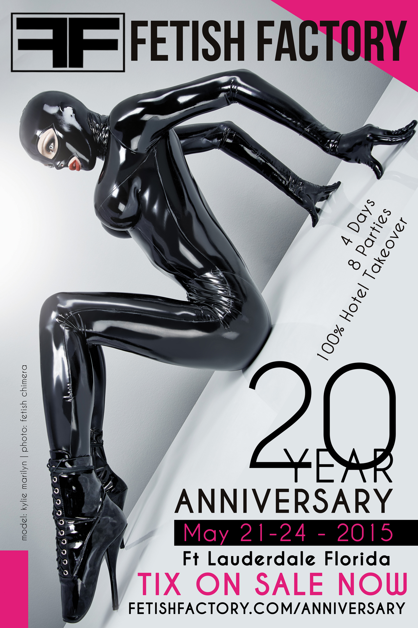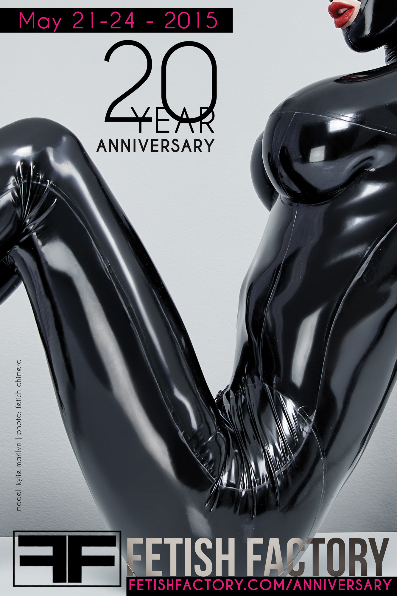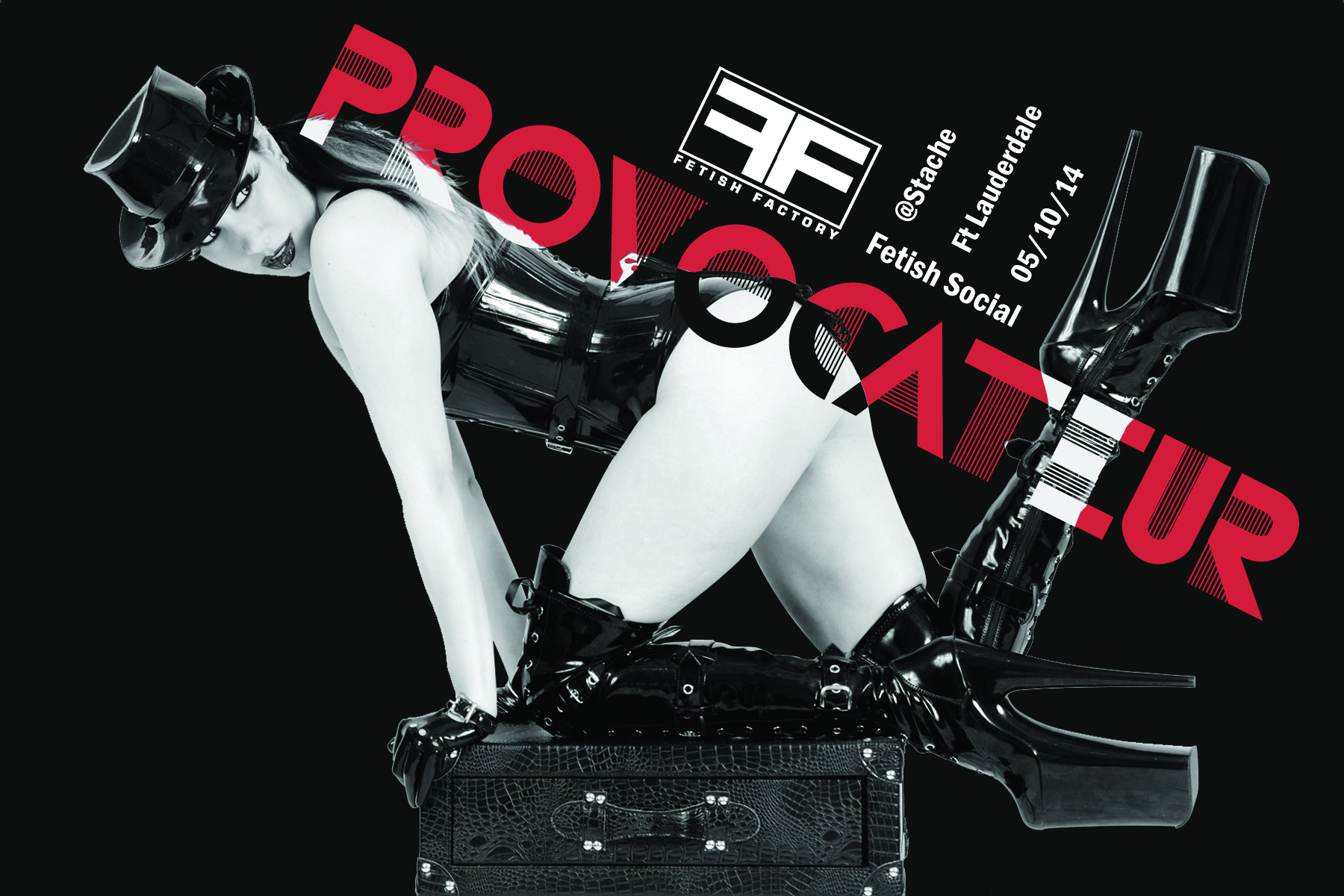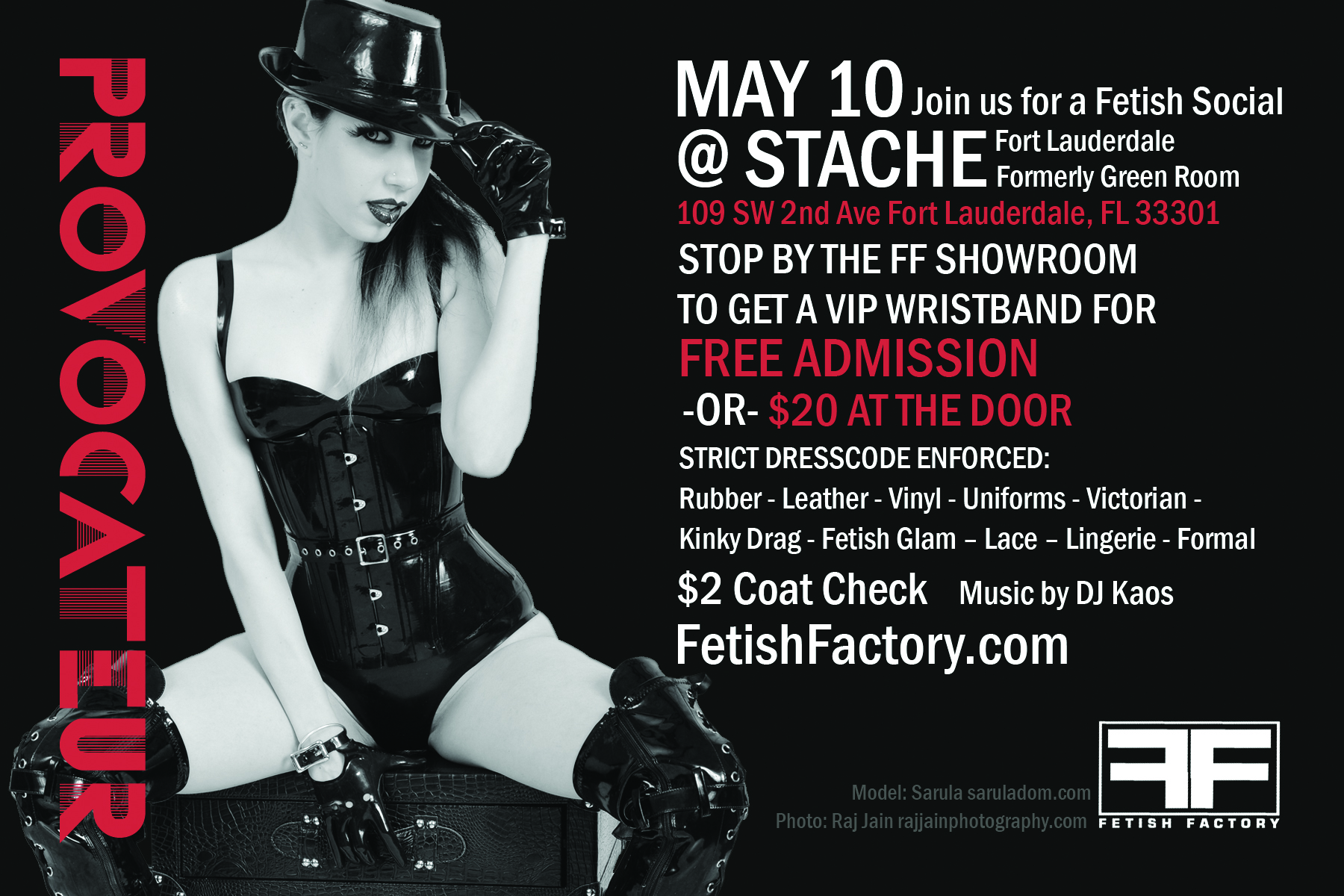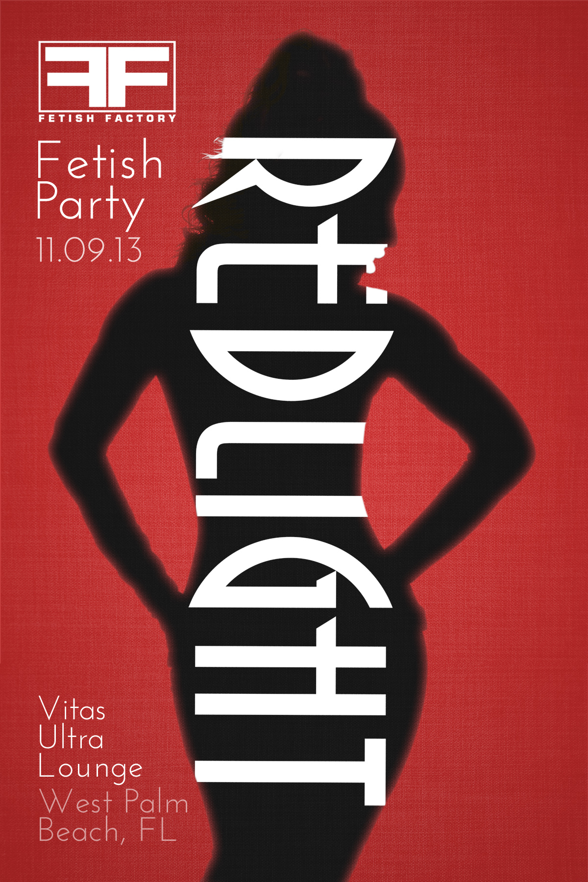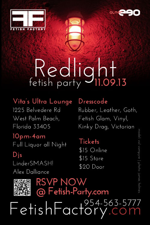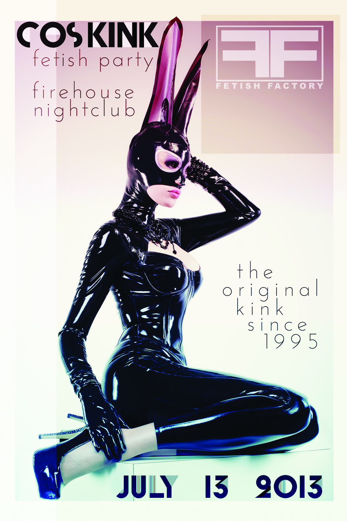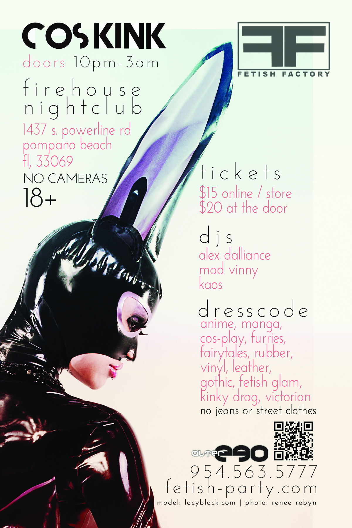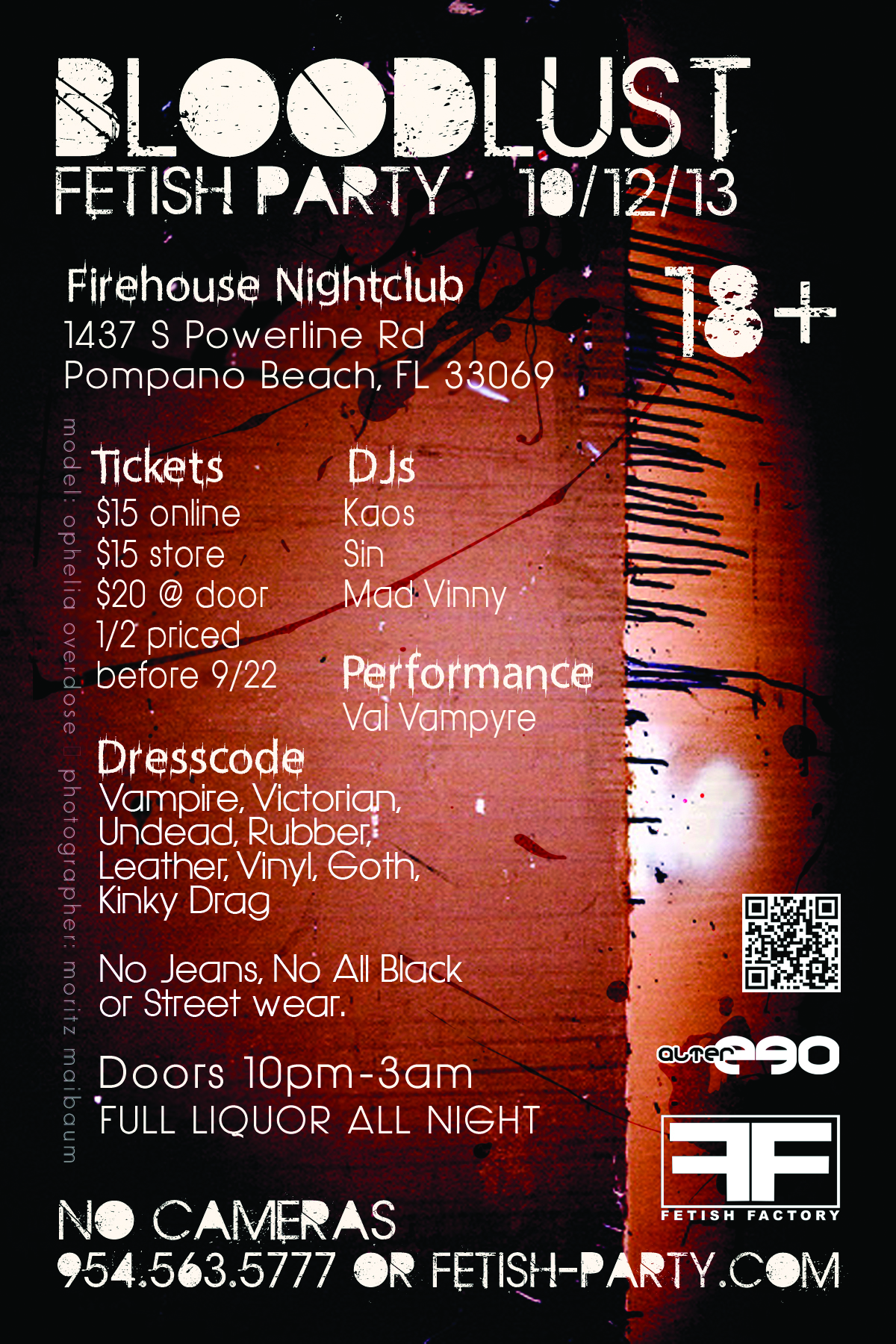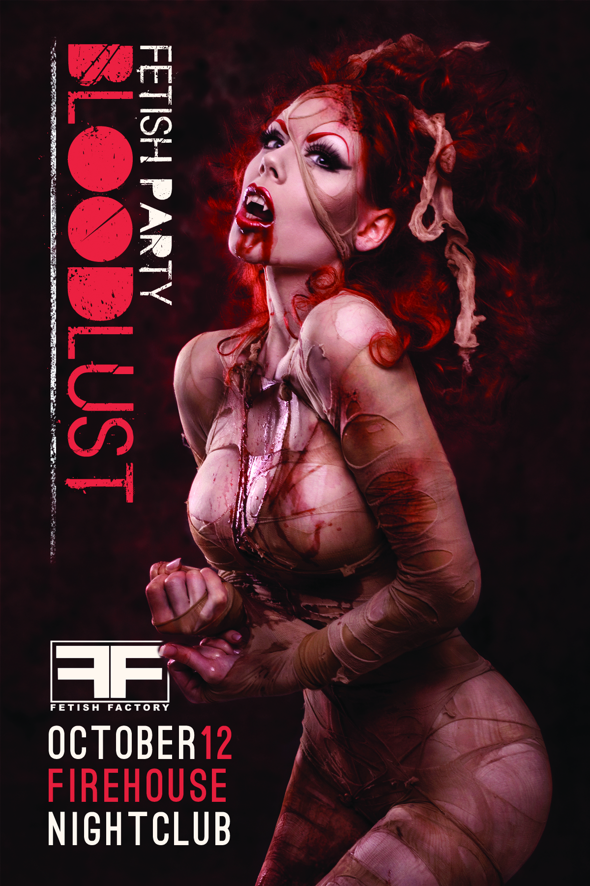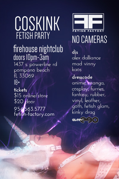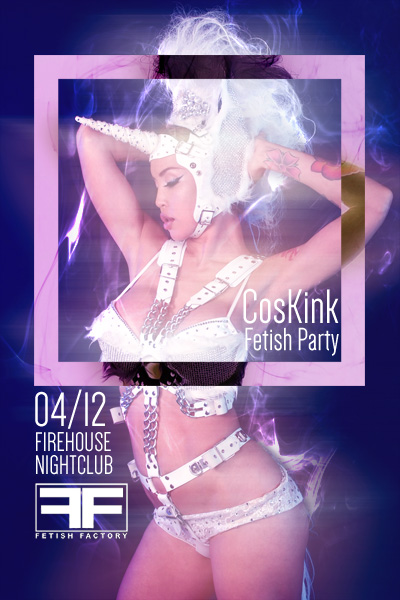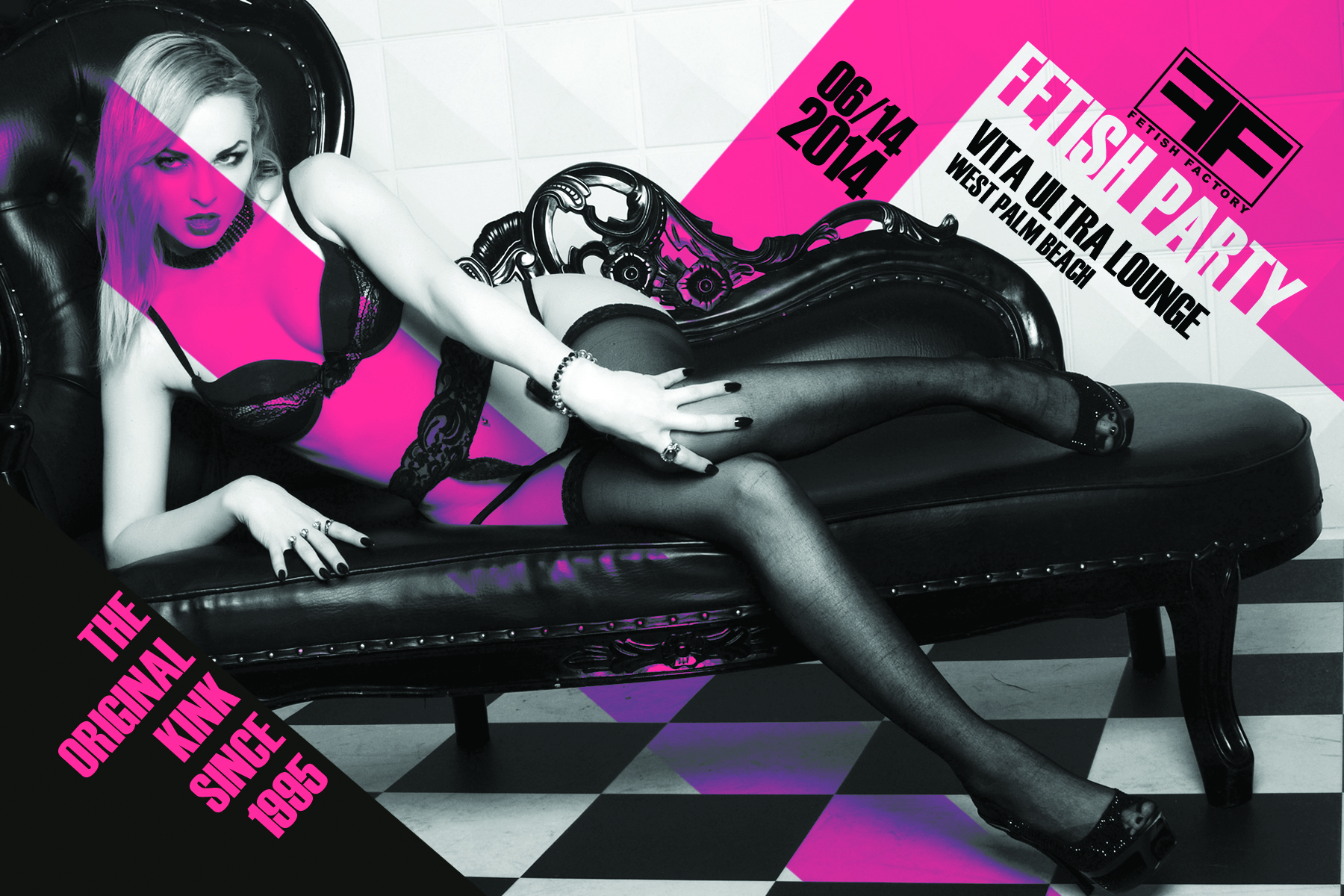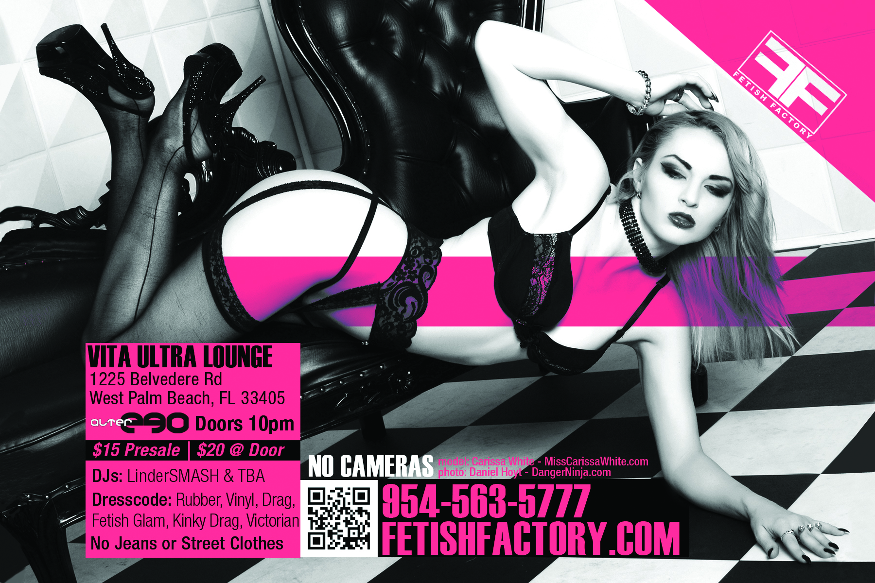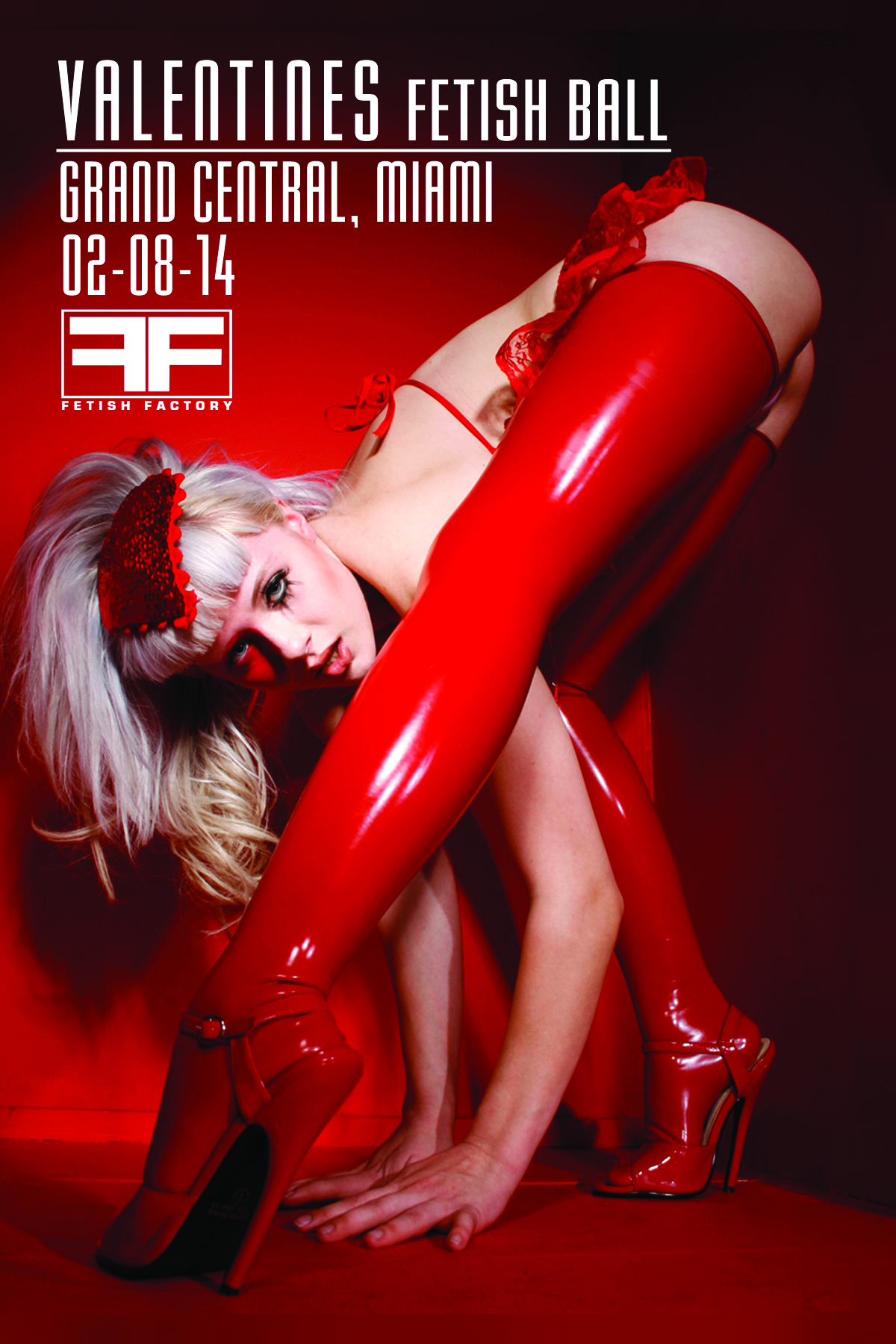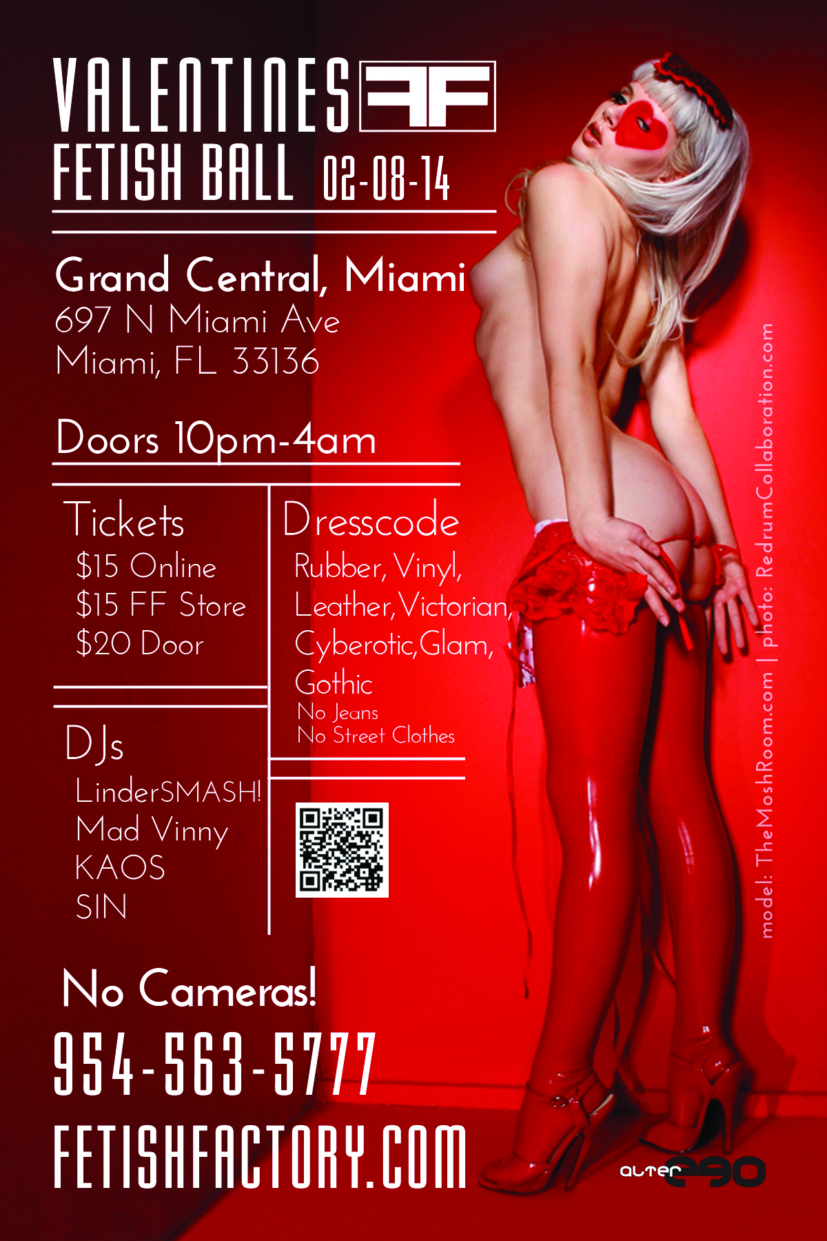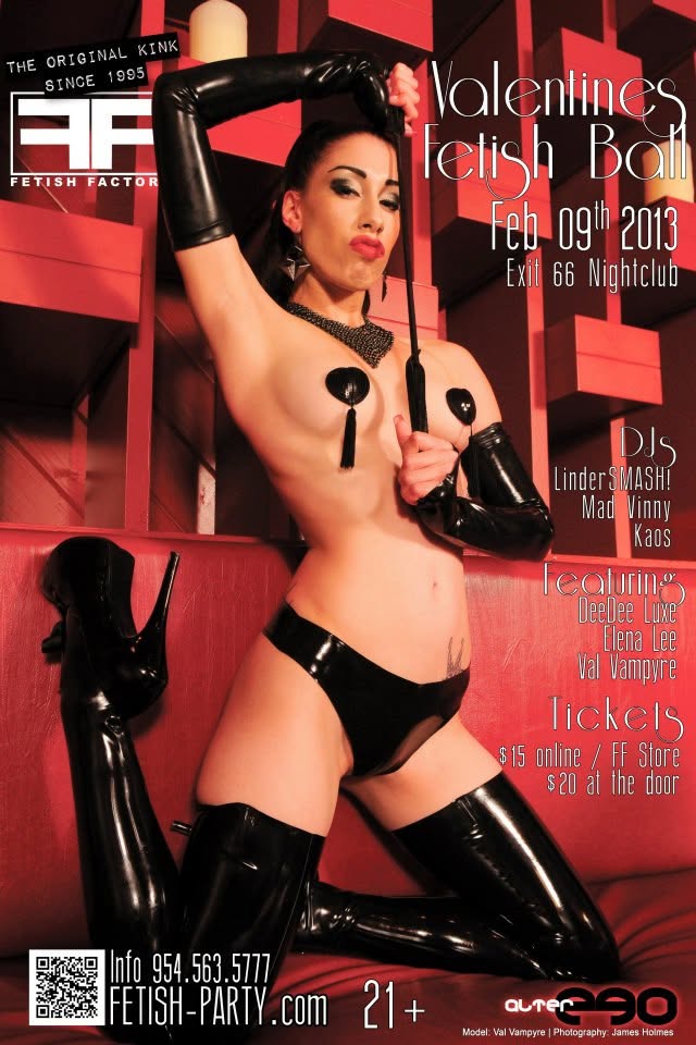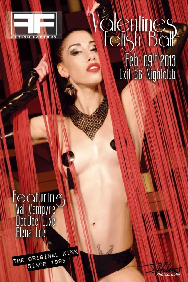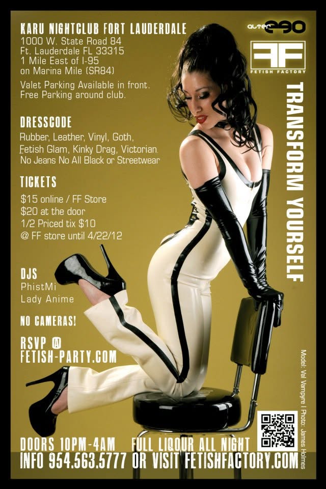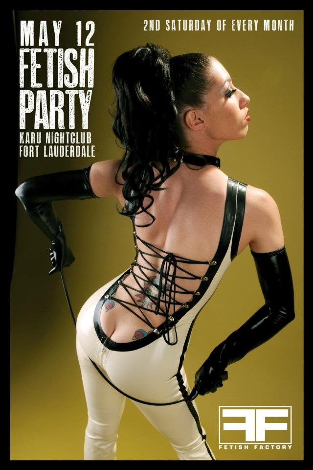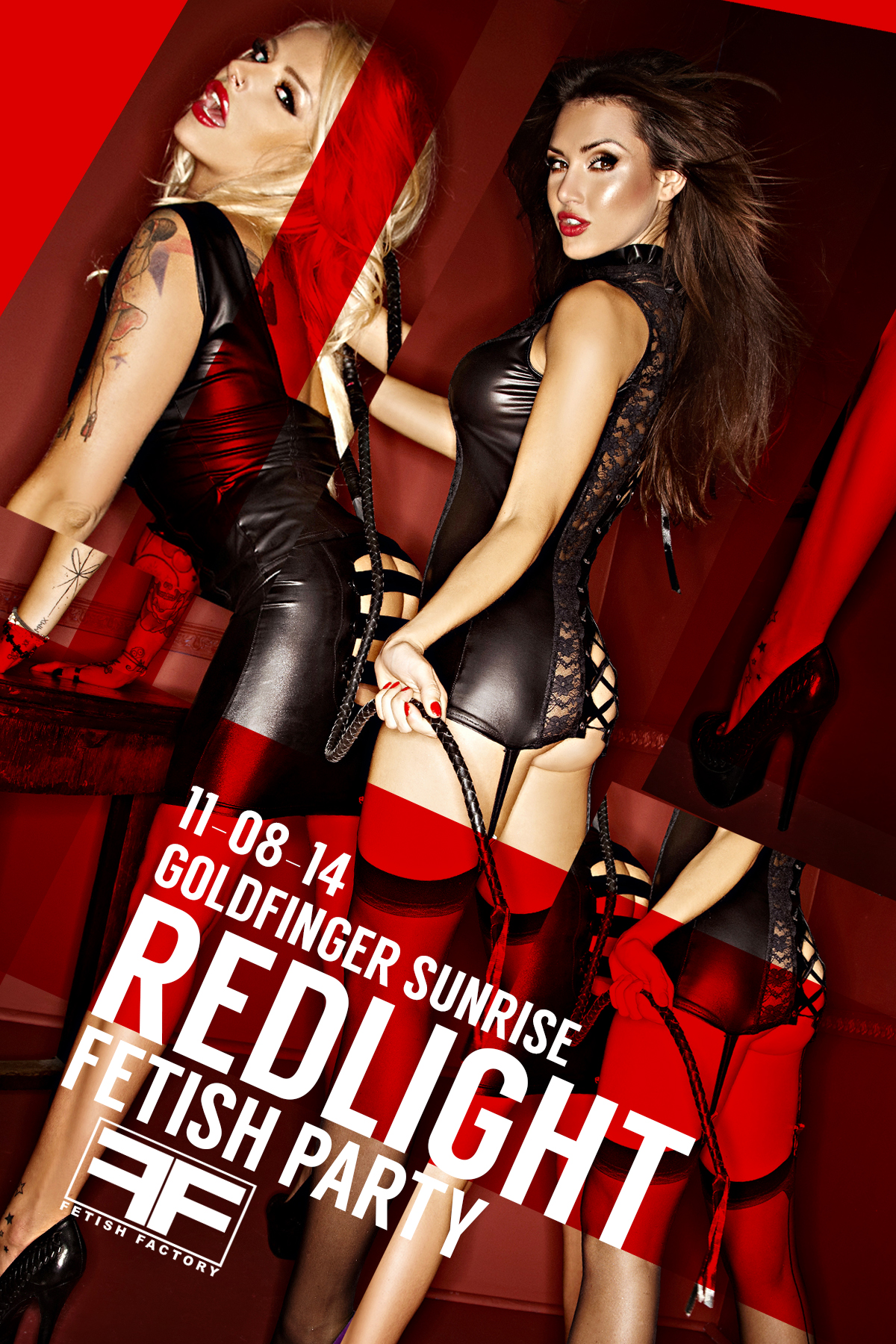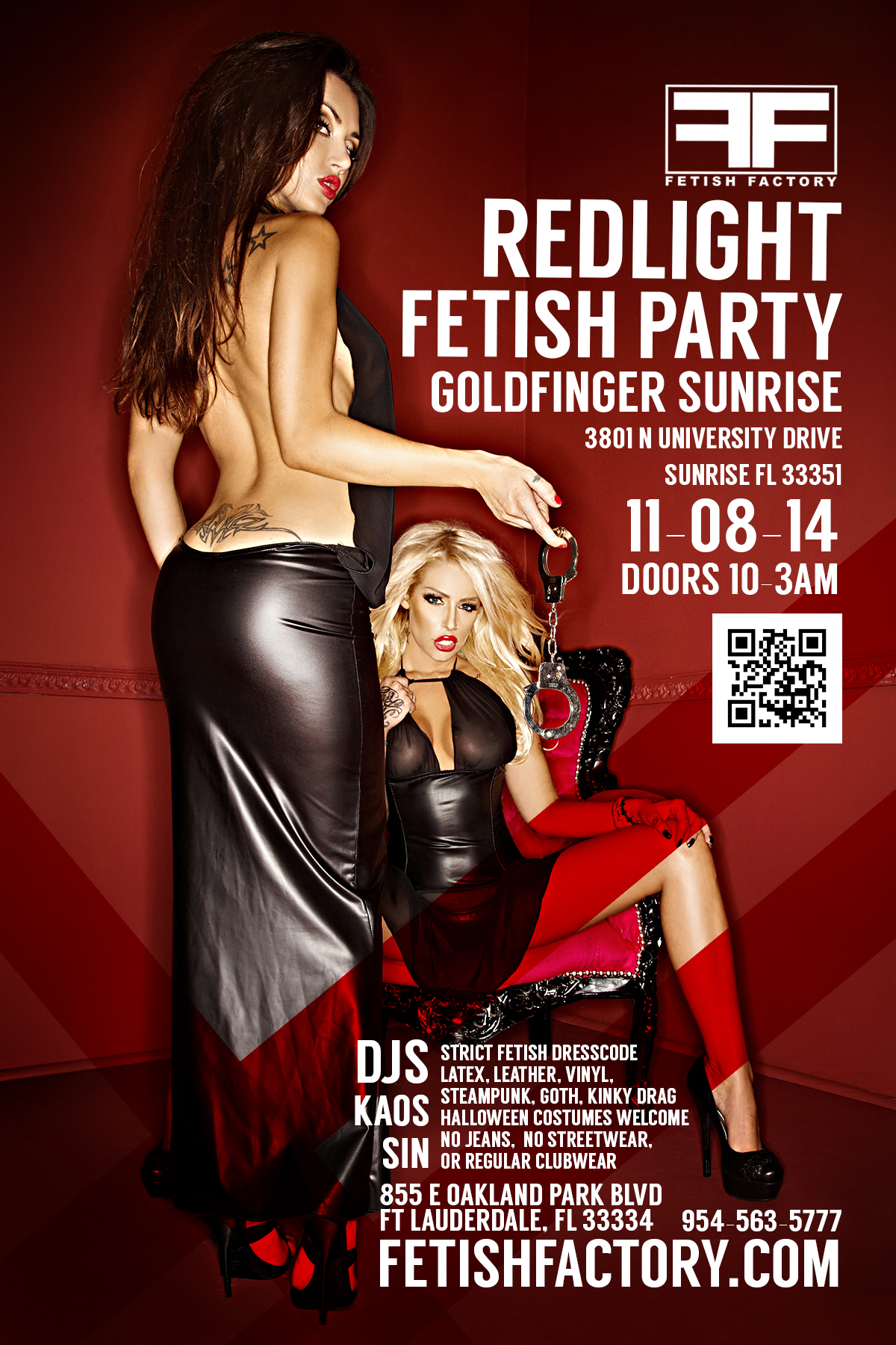
The Fetish Factory was my first job out of college. I was offered two the same day, one a stuffy, boring, strict role as a motion designer, the other with the keys to the kingdom at Fetish Factory. I was told the first day I’d be responsible for design, video editing, club motion graphics, web design, product photography, and directing of photoshoots.
I debated putting this in my formal portfolio, out of scaring away the normies who might be checking out my work, but, I figure I’d scare you anyway if we ever had a conversation. Ha!
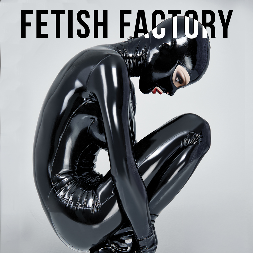
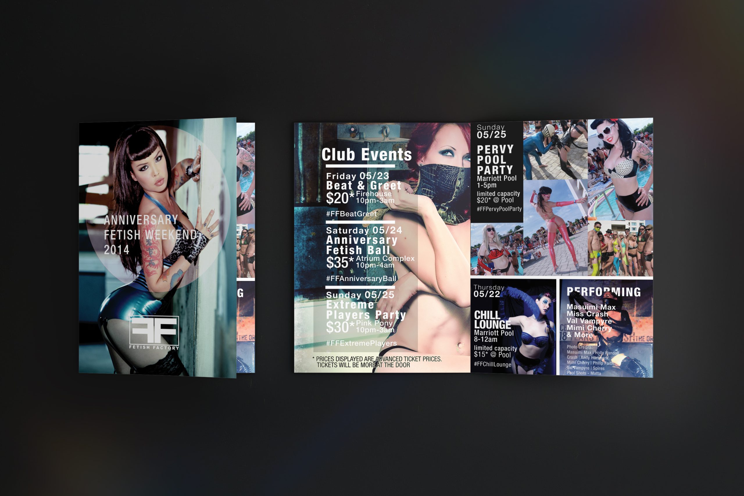
Symmetrical, authoritative, and iconic. The logo was designed far before my time at the company, but I did update it’s elements for a modernized look. Changing fonts from 90’s cheese-fest “Eurostile” to “Akzidenz Grotesk” changed the feel of more than we anticipated. Prior to my hiring, the company’s visual style was stuck in a previous decade. adult industry tropes galore (think pinks, drop shadows, hodge-podge element design, and often losing out on the stopping power the content would naturally give). They were blocked from promoting on social media due to the name itself. We reworked from the ground up and presented the attitude and the clothing as an alt-fashion store, less about the hanky-panky. The intention behind this still stands with the company 15 years later.

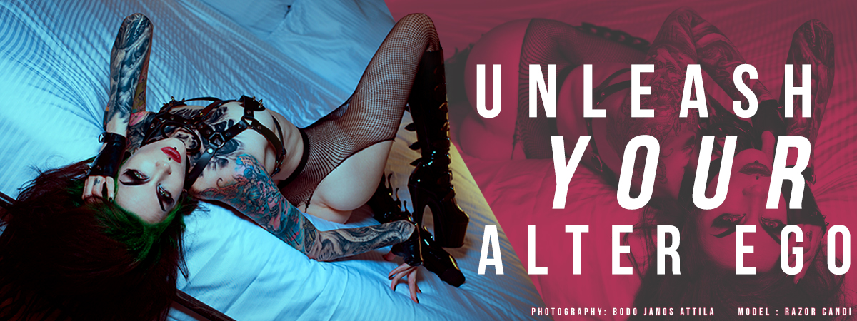
Company Site
Creative Direction: Christopher Lombardo
General Manager: Daniel Martinez